By Anne Kendall
A classic shade gets a new look
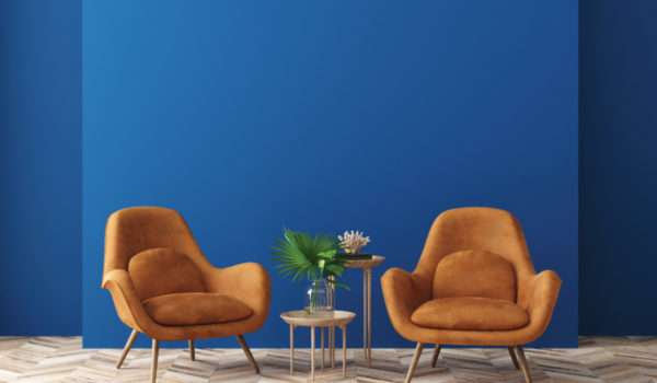
Chalk it up to turbulent political times, a general sense of unease or simply an enduring love of a favorite shade. The “color of the year” has been announced by the influential Pantone Color Institute, and it’s a deep, inky hue it has dubbed “Classic Blue.” At once elegant and reassuring, haute yet homespun, this blue evokes feelings of dependability and stability.
Or so muses Pantone, the U.K.-based group that spends all year combing the globe looking for new color influences, evaluating a range of things from films that haven’t been released yet, to technology and new materials, to what’s coming down the fashion runways, before anointing a color of the year. The decision matters, because its color-forecasting ability is renowned in the fashion and home design industries. Major labels turn to Pantone for a sense of what’s coming next and to make sure they’re turning out sweaters, shoes, bedspreads, wallpaper and iPhone cases in the right palettes. What Pantone approves, you will likely find in the pages of Vogue and the aisles of Target soon.
So why Classic Blue, and why now?
“We are living in a time that requires trust and faith,” says Leatrice Eiseman, executive director of the Pantone Color Institute, in a company press release. “Imbued with a deep resonance, Classic Blue provides an anchoring foundation. A boundless blue evocative of the vast and infinite evening sky, Classic Blue encourages us to look beyond the obvious to expand our thinking, challenging us to think more deeply, increase our perspective and open the flow of communication.”
That may sound like a lot to place on the square shoulders of traditional but quiet navy blue. But Shannon Swails, owner of Franklin’s Blackbird Nest boutique, wasn’t surprised at the selection. “I was kind of tuned in that blue was going to be it,” she says. “I’d been noticing blue a lot in stores, and it just felt timely.” Her shop recently posted on Facebook a stunning credenza refinished in Annie Sloan chalk paint in “Oxford Navy,” a hue startlingly similar to Classic Blue.
“It’s a sophisticated color,” says Swails. “It’s so serene.”
And it’s easily associated with nature — her main source of inspiration — even though it isn’t really found there very easily, she says. “In nature, ironically, you won’t find animals except a butterfly that will be a true blue. The rest can be an illusion, or the way light plays on things, or an offset of a blue: a blue jay, maybe, or a blue-gray whale. If you start looking at it, it’s not a true blue.”
But think water. “If you look at the ocean, and the way it reflects on things, your eye will play tricks on you,” adds Swails. “For me that’s very soothing, very calming.”
That’s also how Mike Barclay, director of exhibitions at Indianapolis Contemporary on the city’s near-south side, describes blue. “It’s a ‘cool’ color on the palette, so maybe with all the hostility and anxiety in the world right now, we need something soothing and calming,” he says. Those are the emotions it evokes for him, anyway.
And, perhaps, so it goes for most of us. Blue is routinely ranked as America’s favorite color, in surveys by House Beautiful, Elle Décor and countless other interior design publications, along with sociological studies. So it’s no surprise that polls also reveal we love seeing paintings of outdoor scenes versus indoor ones, especially scenery with rivers and oceans of vast, endless blue. For all the songs about singing the blues and its association with sadness, tough times, even depression, the color blue ultimately seems to be a source of comfort and harmony for most of us.
But even if a deep, navy blue is deemed too traditional — even boring — by some, Barclay is happy to embrace it. “I’ve seen some online responses that think the color is depressing and too safe of a choice,” he says, “but it’s refreshing to have a safer choice than some of the past colors of the years. Sometimes there’s nothing wrong with a classic, safe color.”
The 2019 pick, by the way, “Living Coral,” was a comparatively vibrant pinky-orange that did seem to suddenly turn up a lot on shelves at the mall. Before that, the annual selection was a deep purple dubbed “Ultra Violet,” then the key lime shade of “Greenery.” The “Rose Quartz” of 2016 bears a striking resemblance to the pale “Millennium Pink” that made such a splash at the time; all feel especially of the moment. By comparison, Classic Blue is the most, well, classic choice in years.
To incorporate a rich shade like this into your home? “It would make a nice bedroom or bathroom color, for certain,” says Barclay. “I would use it in my home office, too, or anywhere I need to relax and concentrate.” That tracks with Pantone’s characterization of blue: “Aiding concentration and bringing laser-like clarity, Classic Blue re-centers our thoughts.”
Barclay also likes the idea of painting a bedroom ceiling with the hue evocative of the nighttime sky. (Pantone, too, proclaims that blue is “imprinted in our psyches as a restful color” and “brings a sense of peace and tranquility to the human spirit, offering refuge.”)
“This particular shade is easy to accessorize with or use for a pop of color,” says Barclay. “I don’t find myself gravitating toward it, but blue is very common in my artwork collection all over my house because I find that it complements so many other colors.”
Swails agrees. “It’s great with greens or with stark whites,” she says. She loves its versatility, pointing out that it can just as easily veer contemporary, traditional, modern or country.
And it isn’t going away anytime soon. Blue isn’t just of the moment; it’s a no-fail classic. “When we look at decor, that tends to change yearly, and we do tend to follow what would be popular in fashion,” says Swails. “But blue is always in style and on trend. Especially when you’re talking about deeper shades of blue, I think those are traditional colors that never end. I see blue as just a staple color in people’s homes.”
And that, she says, is not likely to change, even when the inevitable 2021 Pantone color of the year comes around.
“Different shades have their moments and their times,” Swails says. “The darker tend to outlast the lighter shades because of the sophistication. They last the test of time better.”