Colors of the year feature diverse shades
By Anne Kendall
Walk into Tracy Bohler’s house, and you will be drenched in sunny shades of yellow. It shines from the two-story entryway. In most of the bathrooms. The dining room is done up in an especially bright shade that bears a striking resemblance to this year’s “color of the year,” as crowned by the Pantone Color Institute: “Illuminating,” a color that can’t really be called anything but, well, yellow. Not “buttercup.” Not “saffron.” Nope — just a pure, striking, no-bones-about-it yellow.
So Bohler, owner of Farm Girl Mercantile in Franklin, is tickled that her selection has the Pantone stamp of approval. Every year, the PCI — a division of Pantone, the U.K.-based color authority — announces its pick for color of the year. It’s a shade you can count on suddenly seeing everywhere, from home decor stores to your favorite clothing boutiques to TV backdrops. To arrive at it, PCI combs the globe looking at upcoming films, art exhibits, hot travel destinations, new technologies, even big-time sporting events — anything that might lend a clue to the hues we’ll be craving.
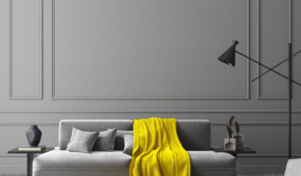
But! This year, PCI broke with tradition by choosing two colors and deeming the pairing of them the vaunted color of the year. Illuminating’s co-winner couldn’t be more different: “Ultimate Gray,” which is pretty much what it sounds like. PCI calls the duo “practical and rock solid, but at the same time warming and optimistic.”
This is only the second time in two decades that PCI has picked two separate shades as its color of the year. Its goal: that the color of the year “reflects what is taking place in our global culture, expressing what people are looking for that color can hope to answer.” So, what to make of dueling colors of the year? A reflection of a splintered society? Or does it just take double the color to shake off the 2020 doldrums? “Positivity supported by fortitude” is, after all, how Pantone describes the pair.
“You could read a lot into it,” says Anne Surak, director of Exhibit Columbus. “Maybe there needs to be a conversation between two things instead of standing alone and shouting.”
The experts at Pantone clearly like how the shades talk to each other. “The selection of two independent colors highlight how different elements come together to express a message of strength and hopefulness that is both enduring and uplifting, conveying the idea that it’s not about one color or one person, it’s about more than one,” said Leatrice Eiseman, executive director of the Pantone Color Institute, in a press release. “The union of an enduring Ultimate Gray with the vibrant yellow Illuminating expresses a message of positivity supported by fortitude.”
Pantone’s decision is incredibly influential. Its color-forecasting ability is renowned in the fashion and home-design industries. Businesses ranging from Prada to Target turn to Pantone for a sense of what’s coming next and to make sure they’re turning out sweaters, shoes, blankets, wallpaper and iPhone Airpod cases in the right palettes. If a color (or pairing of colors) gets Pantone’s stamp of approval, you’ll be seeing it everywhere soon, if you aren’t already.
“They’re definitely complementary and eye-catching,” says Surak. “It’s an optimistic pairing — something we’re all looking for these days.”
Bohler agrees. “A neutral color like gray is such a great backdrop for something eye-popping like that yellow. You wouldn’t think they would go well together, but they do. It’s happy, it’s joyful; with 2020 behind us, I think a lot of people have started appreciating their homes more.”
Almost all of Bohler’s customers at Farm Girl Mercantile are redoing at least one room, she says. “They’re pulling everything off the walls and often going for a gray. It goes well with the farmhouse trend that is so popular. Then you always want to add that pop of color. This yellow is bold, but not too bold, especially if you’re just adding little bits of it here and there.”
Together, the pairing of colors can definitely veer bold when they want to, says Surak, which is necessary. “There’s so much noise in the world right now, these colors had to stand out to be paid attention to.”
Since they’re such attention-grabbers, Surak envisions using them mostly in accent roles, like drapery or the pattern on a skirt. “But that gray would make a lovely suit,” she says, “or it could be a sofa fabric.” It also evokes “modern office” to her: “It feels very Herman Miller,” she says. Are we subconsciously missing the social workplace after so many months of #WFH?
As for accents, the Pantone experts themselves are on the same wavelength, suggesting Ultimate Gray as a “bouncing off point,” with Illuminating brightening things up by way of a scarf, shoes, handbag or shawl. The pairing’s “energetic presence” also makes it a great choice for activewear, suggests the company, and its high visibility ups its appeal for outerwear.
For home decor, where grays have already replaced beige as the new neutral, Pantone floats the idea of a front door in Illuminating to add a dose of “sunshine and positivity.” Bohler likes the idea of Ultimate Gray in a bedroom, where its calming effect would be welcome, or in a family room.
She’ll keep her bright yellow bathrooms, though. “When you’re getting ready for work in the morning,” she says, “you want to be happy.”
The colors are quite versatile, says Bohler, working for men and women alike, and great in kids’ and teens’ rooms. For that reason and others, Surak expects we’ll indeed start seeing them a whole lot more. She thinks they’ll resonate with buyers looking for something fresh for their homes, closets and lifestyles.
“Whatever color Pantone presents always works its way into those things,” she says.